Common Mistakes to Avoid in Graphic Design Projects
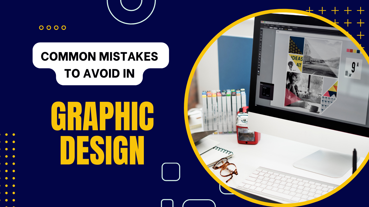
In the fast and always changing world of graphic design, where creativity meets practicality, it’s essential to avoid common mistakes for great results. Graphic design projects need careful attention to detail, a good sense of what looks good, and a deep understanding of how design works. In this guide, we’ll explore the ins and outs of graphic design, pointing out common mistakes and giving useful tips to make sure your projects not only meet but go beyond what you expected. If you’re looking to enhance your design skills, you can make graphic design online using various digital tools and platforms.
1. Inadequate Research: The Foundation of Design Excellence
Embarking on a graphic design journey without thorough research is akin to building a house without a solid foundation. Research is not merely a preliminary step; it’s the very foundation upon which design excellence is built. Understanding the target audience, staying abreast of industry trends, and grasping client preferences sets the stage for creating a visually compelling and effective design. Research isn’t a one-time affair; it’s an ongoing process that informs and guides every aspect of the design journey.
2. Ignoring the Power of Typography: The Unsung Hero
Typography is not just about selecting fonts; it is a powerful design element that can either elevate or undermine your project. Choosing the right typography involves delving into aspects like readability, appropriateness, and alignment with the overall design concept. Neglecting this crucial aspect can lead to a disconnect between the intended message and its visual representation. In this era of digital dominance, where content is king, mastering the art of typography is a skill that can set your designs apart.
3. Overlooking Color Theory: The Palette Paradox
Colors evoke emotions and play a pivotal role in conveying a brand’s identity. Understanding color theory is not a luxury; it’s a necessity for selecting a palette that resonates with the target audience and aligns with the brand’s essence. The psychology of color is a realm that designers must navigate with finesse, ensuring that every hue communicates the intended message effectively. Ignoring color psychology can result in a visual mishmash that fails to captivate and engage the audience.
4. Cluttered Design: Less is More
In the pursuit of creativity, the allure of excessive elements often proves tempting. However, a cluttered design overwhelms the viewer and dilutes the core message. Embracing simplicity is not a compromise; it’s a strategic choice that allows for a clean and impactful design, ensuring the viewer’s attention is directed precisely where it matters most. Striking the delicate balance between creativity and simplicity is an art form that separates exceptional designs from the mediocre.
5. Inconsistency Across Platforms: The Branding Blunder
Maintaining consistency across various platforms is not just a design principle; it’s a branding imperative. Consistent branding elements, from logos to color schemes, build brand recognition and trust. Failing to adhere to a cohesive design across platforms can lead to brand confusion and dilution of the brand’s visual impact. In an era where brand loyalty is cultivated through visual recognition, consistency is not just an option; it’s a strategic advantage.
6. Neglecting Mobile Responsiveness: Design for Every Device
In an era dominated by mobile devices, neglecting mobile responsiveness is not just a design flaw; it’s a cardinal sin. Ensuring that your designs are optimized for mobile devices is non-negotiable. Google’s algorithms prioritize mobile-friendly websites, and a failure to cater to this audience can lead to a significant drop in search rankings. Mobile responsiveness is not an afterthought; it’s a design philosophy that recognizes the diverse ways users access and interact with content.
7. Forgetting the User Experience: Design with Intent
A visually stunning design is only half the battle won; the other half lies in providing an exceptional user experience. User-centric design involves understanding how users interact with your design and ensuring that the journey is seamless and intuitive. Ignoring user experience can result in high bounce rates and diminished online visibility. Every click, scroll, and interaction should be meticulously crafted to enhance the user’s journey and leave a lasting impression.
8. Skipping Proofreading: The Devil is in the Details
Even the most visually appealing design can be marred by typographical errors and grammatical mistakes. Thorough proofreading is not just a formality; it’s a commitment to maintaining a professional image and upholding the integrity of the message. Overlooking this step can lead to a loss of credibility and adversely affect search engine rankings. In a digital landscape where every pixel matters, precision in language is equally paramount.
9. Embracing Sustainability: Design with a Purpose
As the world gravitates towards sustainable practices, incorporating eco-friendly design principles is not just a trend; it’s a responsibility. Embracing sustainability in graphic design involves making conscious choices, from selecting eco-friendly materials to minimizing environmental impact. Designing with a purpose goes beyond aesthetics; it’s about creating a positive impact on the planet and resonating with an audience that values ethical and sustainable practices.
10. Continuous Learning: The Design Evolution
In the dynamic realm of graphic design, staying ahead means embracing a mindset of continuous learning. The design landscape evolves, and so must designers. Keeping abreast of emerging technologies, design trends, and tools is not just an option; it’s a professional obligation. Continuous learning ensures that your designs remain relevant, cutting-edge, and capable of standing out in a crowded digital space.
Conclusion
Navigating the intricate world of graphic design demands not just creativity but a strategic approach that anticipates challenges and embraces opportunities. Avoiding common mistakes is instrumental in delivering projects that not only captivate but resonate with the intended audience. From meticulous research to prioritizing user experience and embracing sustainability, each step in the design process plays a pivotal role in ensuring success.
Also, read our blog on “Protect Your Business and Clients : Essential Contract Templates“.
FAQs
What are some common mistakes to avoid in graphic design projects?
Graphic design projects often encounter pitfalls such as inconsistent branding, poor typography choices, and overcrowded layouts. This blog explores these and other mistakes to help you create more effective designs.
How can inconsistent branding negatively impact a graphic design project?
Inconsistent branding can confuse your audience and dilute your message. It’s essential to maintain a cohesive visual identity across all design elements to reinforce brand recognition and trust.
How can the misuse of images affect the quality of a design?
Inappropriate or poorly sourced images can diminish the overall quality of a design. This section explores the importance of high-quality, relevant images, as well as the potential legal issues associated with improper image use.


